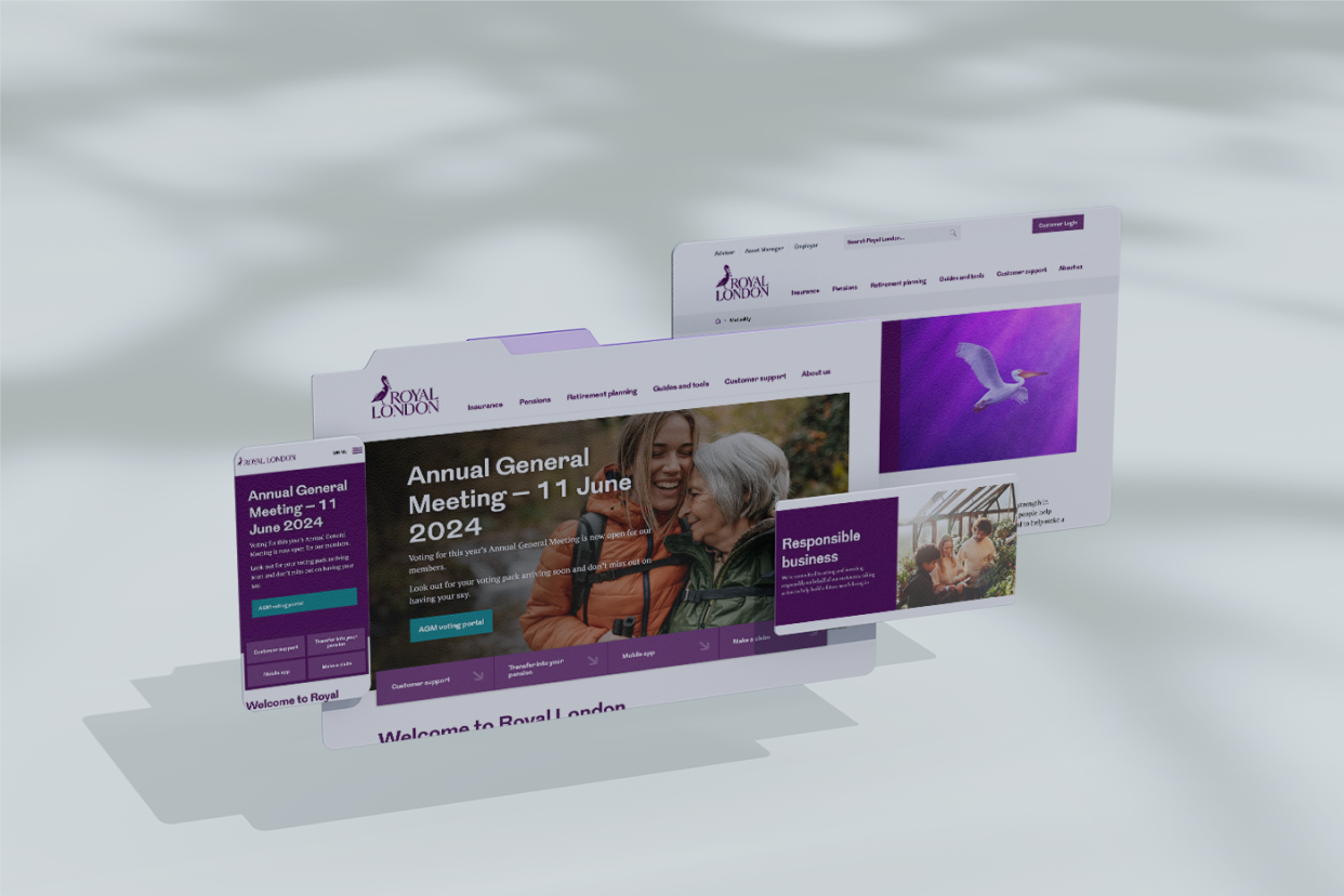
In the Design system team is aligning the look and feel across all business platforms.
/About the project
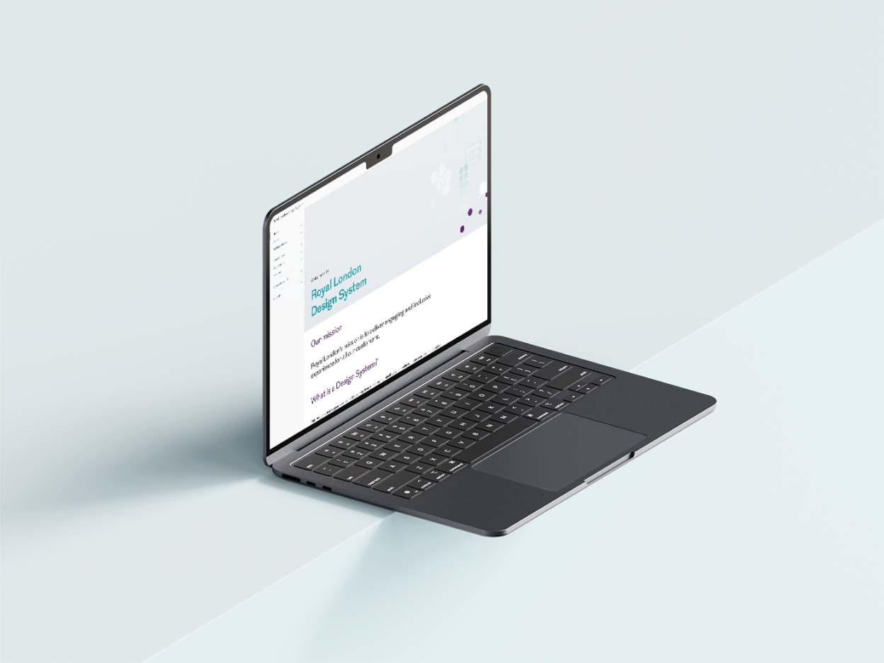
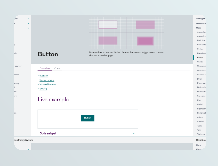
The Royal London Design System brings together a scattered design language, creating consistency without stifling creativity. It’s a work in progress—constantly evolving to meet the needs of different teams. By stepping away from a rigid front-end framework, the system becomes more adaptable. Of course, this means balancing flexibility with control—a challenge that requires ongoing tweaks and collaboration. It acts as a shared foundation for designers and developers, making prototyping easier and UI components more consistent. But adoption takes time, and ensuring it genuinely supports everyone’s workflow is an ongoing process. My work spans governance, component architecture, design tokens, and process optimisation—constantly refining the system to make it genuinely useful rather than just another set of rules.
/Intro points
Future-proof flexibility
We remove reliance on a single front-end framework, ensuring the system adapts to different tech stacks with ease. Of course, flexibility comes with its own set of challenges—balancing innovation with stability isn’t always straightforward. But by prioritising adaptability, we create a system that evolves rather than becomes obsolete.
One unified system
Creating a single source of truth helps eliminate inconsistencies and speed up design decisions—but it’s not a magic fix. Getting teams to trust and adopt the system takes ongoing education, feedback, and iteration. It’s a constant process of refining and proving its value.
Faster, smarter design
DM Mono — structured, Reusable components and clear guidelines make life easier for designers, but only if they’re intuitive and genuinely useful. We learn quickly that no matter how polished the system is, without strong documentation and real-world testing, adoption stalls. It’s about refining as we go, not assuming we’ve got it right the first time.. Reserved for captions, metadata, and UI labels.
/My role
A brief overview of the project, its goals, and the problem it aims
Crafting components that work
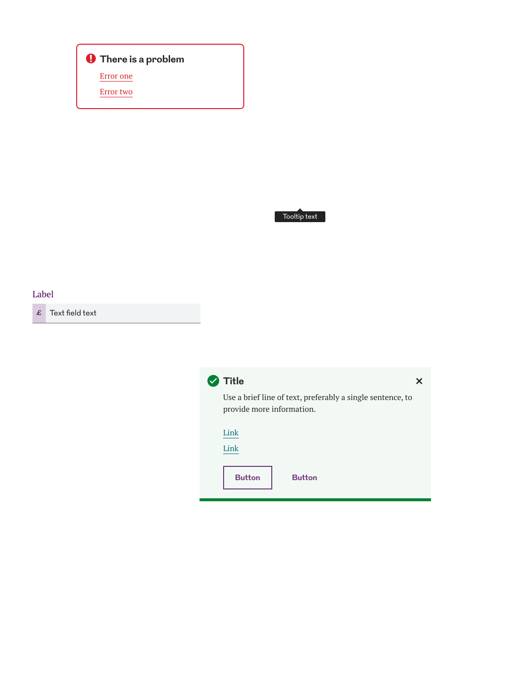
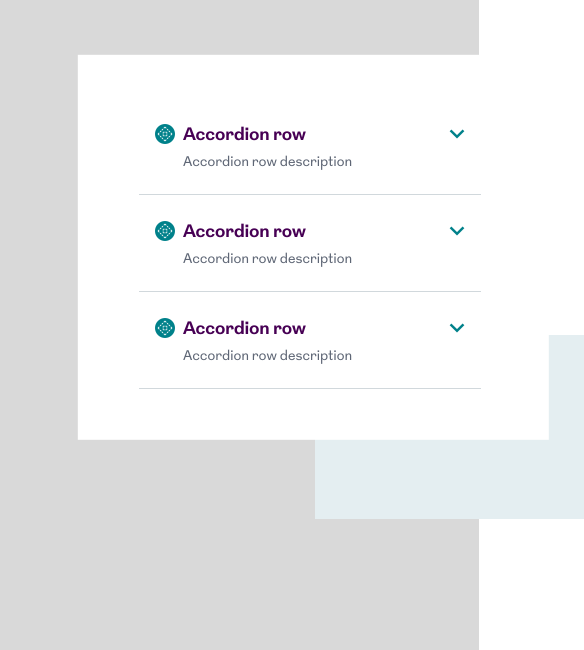
I work closely with UX researchers and accessibility experts to design components that are as flexible as they are functional. The goal? A set of UI elements that can be used across products with zero fuss.
Making design tokens work
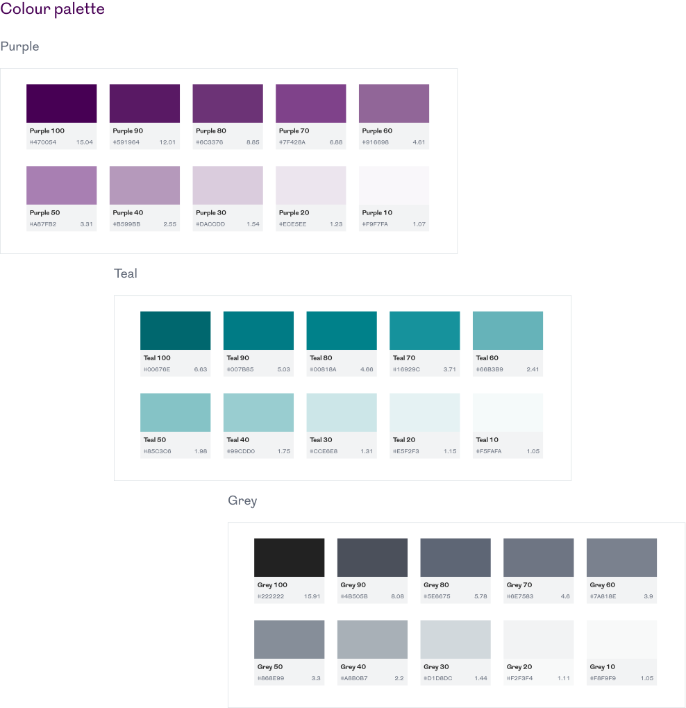
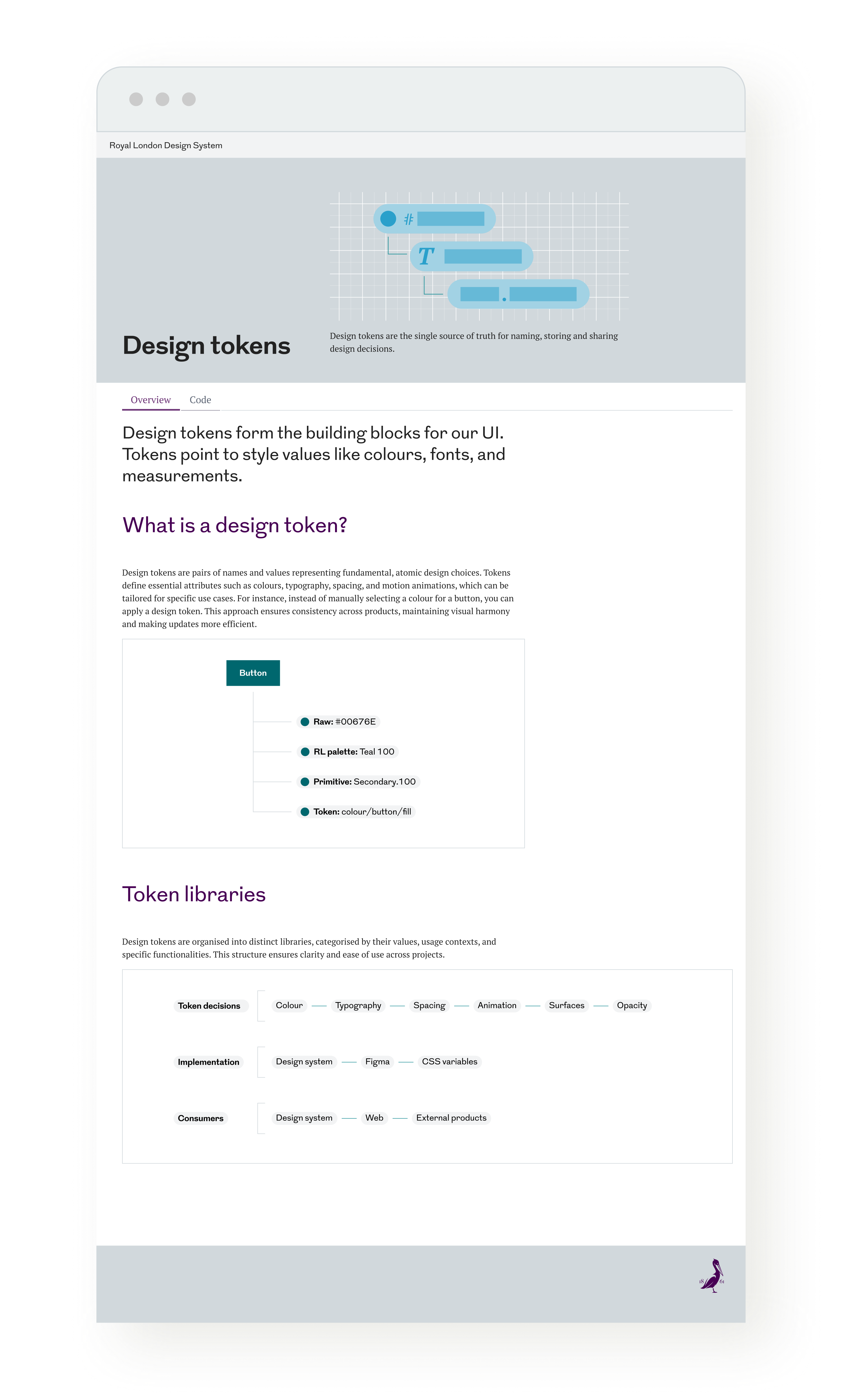
Design tokens are a game-changer, giving the system a layer of flexibility that makes updates a breeze. I structure them to be easy to use and even easier to maintain.
Keeping collaboration strong
Beyond pixels and layouts, I make sure the team works like a well-oiled machine—whether that’s through structured sprints, retrospectives, or just making sure everyone has a voice in shaping the system’s future.
Components
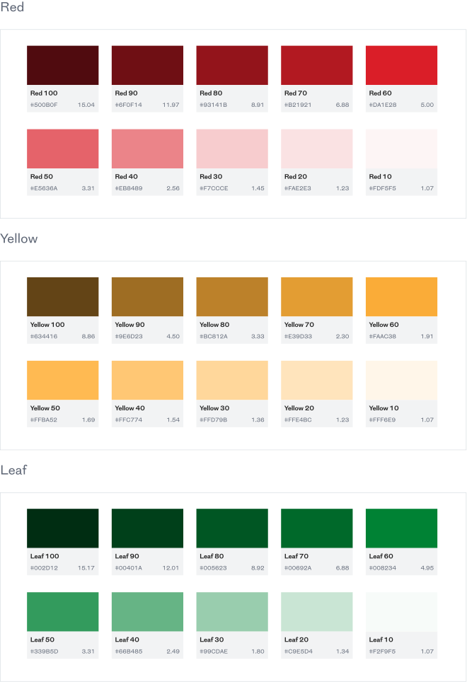
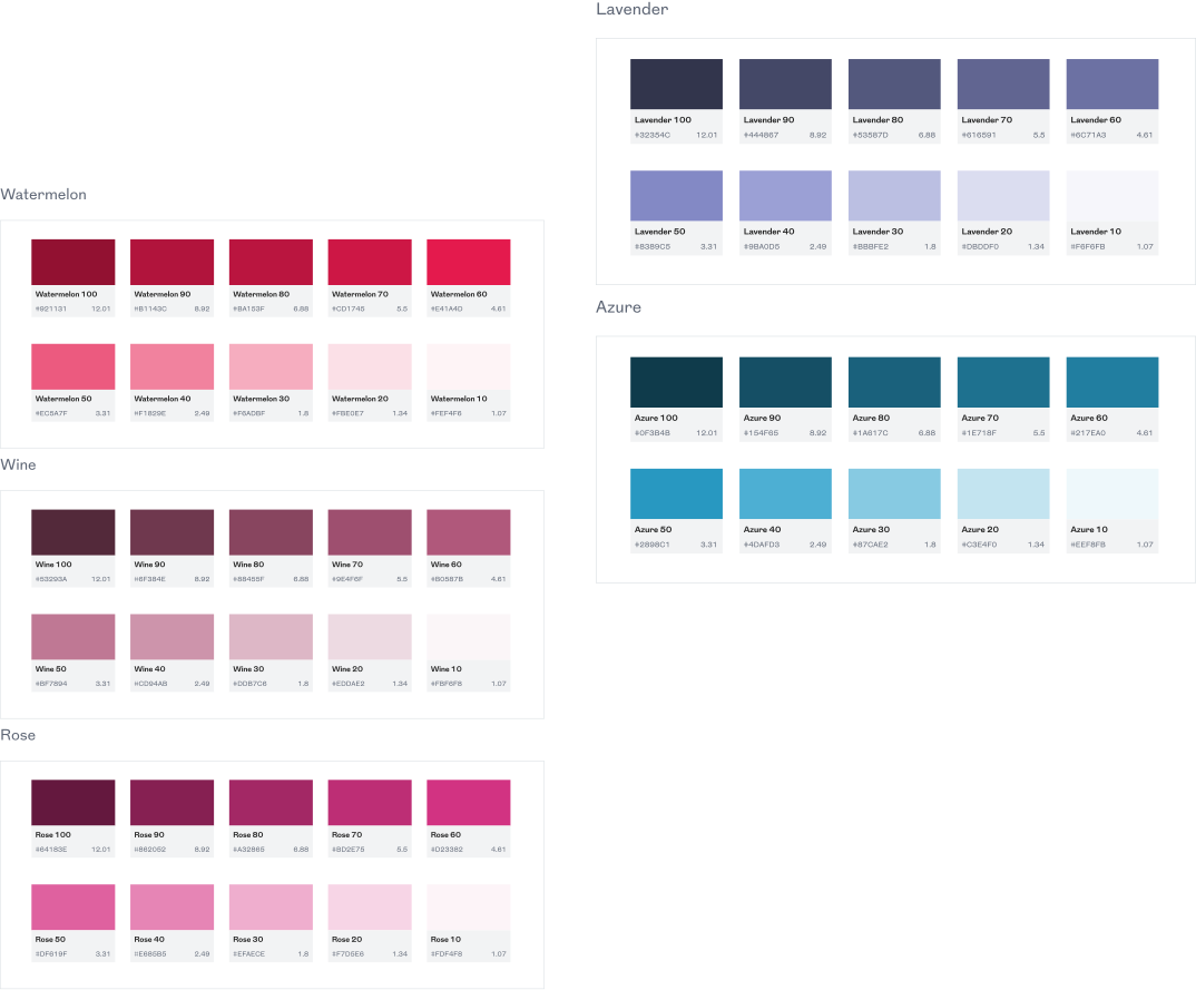
Foundations
Guidelines
/The system in action
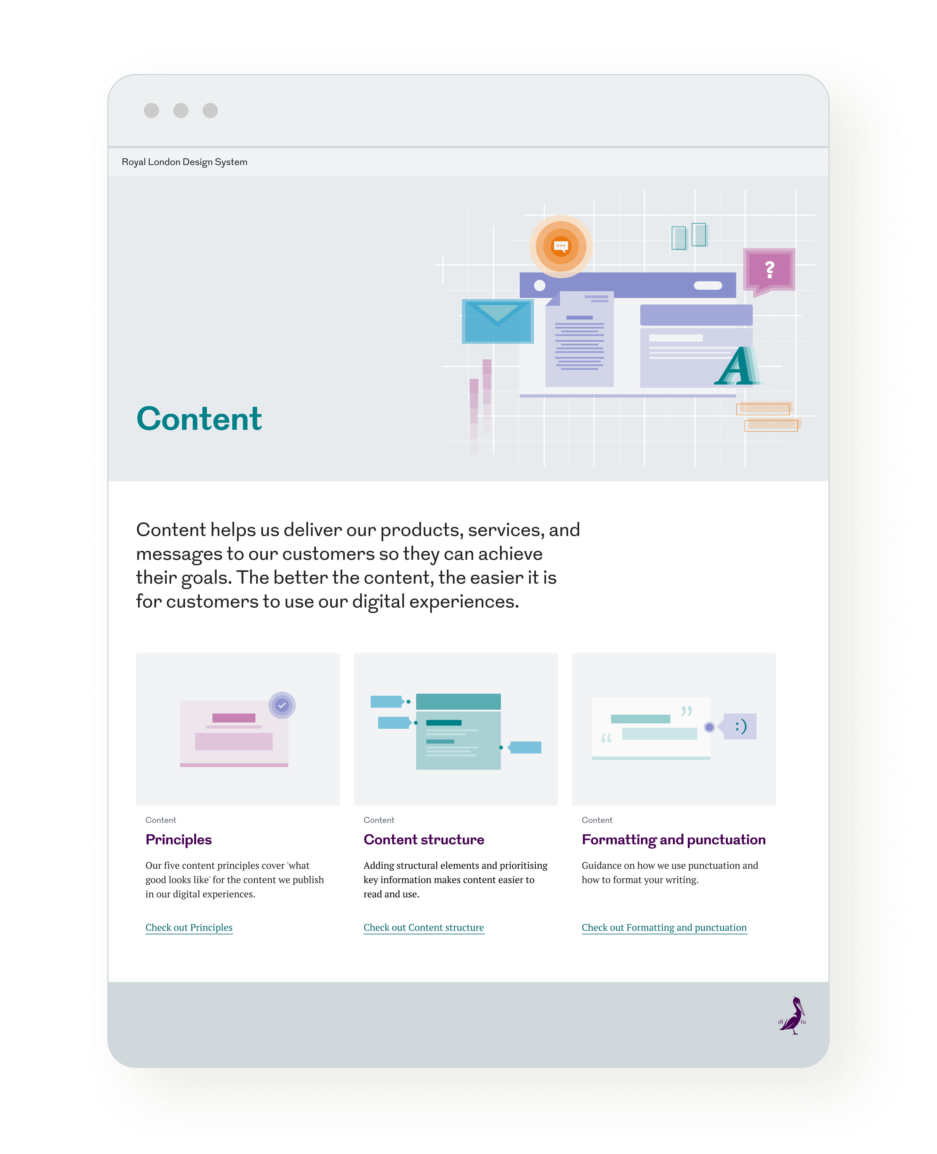
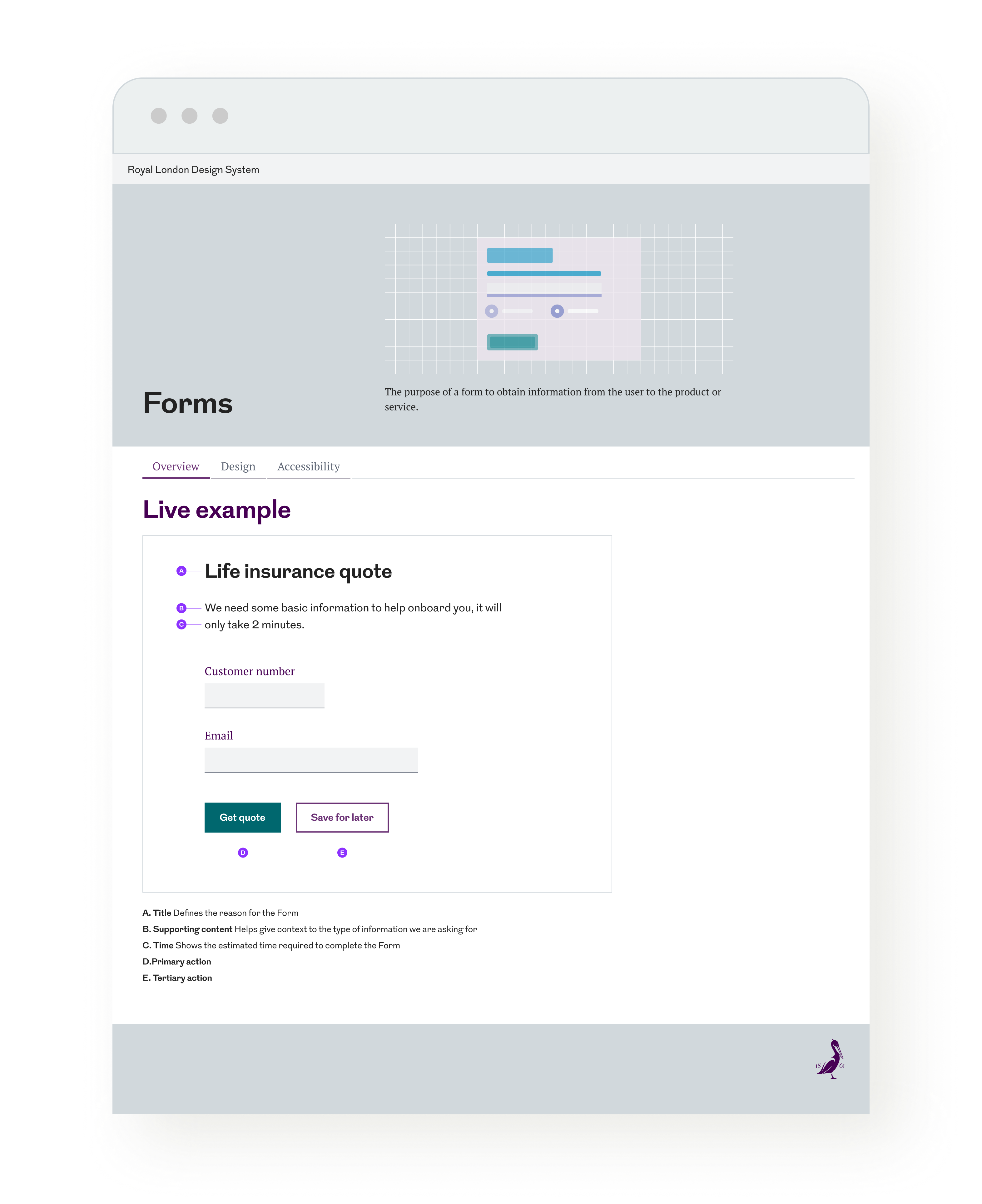
Useful guidelines
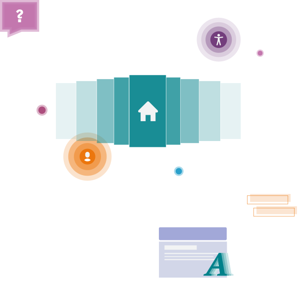
No one wants to trawl through a rulebook. We make sure guidelines are packed with real product examples, making them useful rather than just theoretical.
Data-driven improvements
Thanks to Figma metrics, we get a clear picture of which components are pulling their weight and which need a rethink. A proper game-changer.
Keeping the system alive
Keeping the system alive takes work. Regular feedback loops, collaborative sessions, and a flexible approach ensure it evolves rather than gathers dust.
/Lessons learned
Design systems aren’t just about tidying up UI—they’re about making work smoother, removing roadblocks, and helping teams move faster without cutting corners. This project is a great reminder that collaboration, real-world testing, and a bit of data-driven decision-making make all the difference. More than anything, it shows how a well-maintained design system can be the backbone of digital products, keeping everything consistent without stifling creativity.