Building a multi brand Design system for web and app interfaces.
/About the project
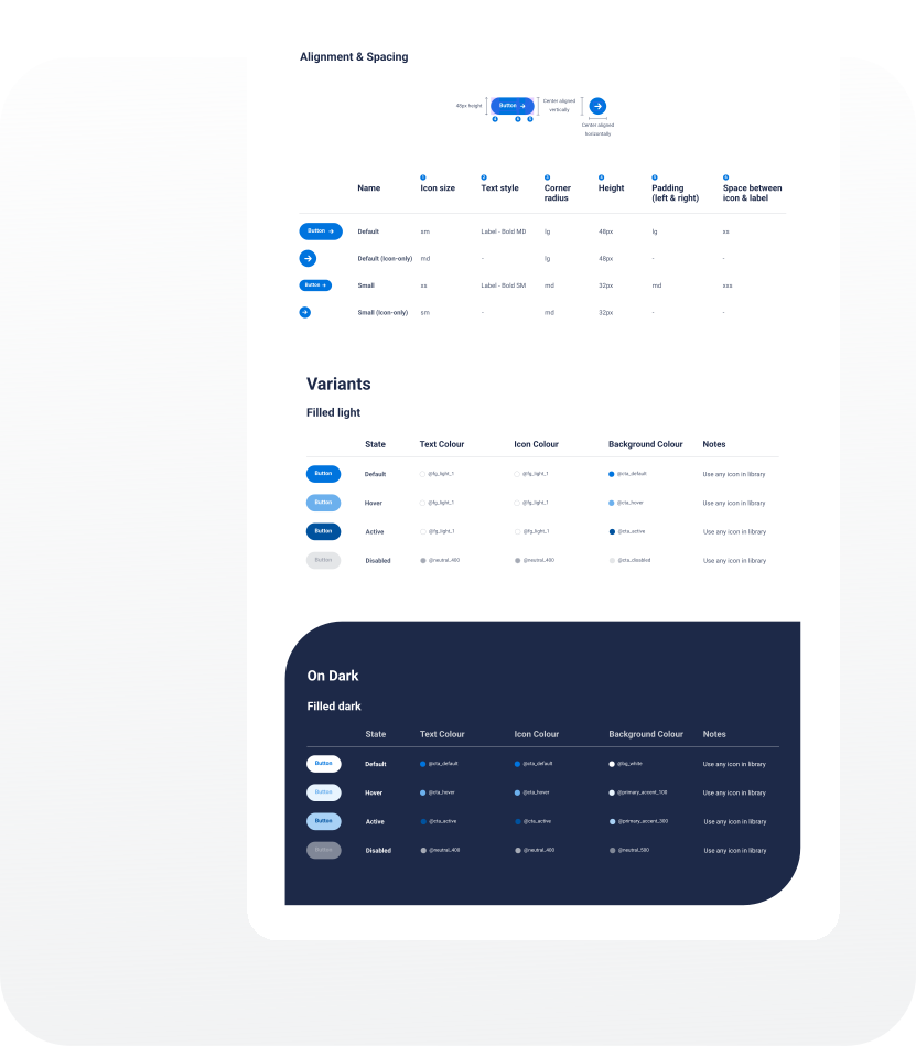
From defining foundational principles and design language to structuring components and guidelines,the system was designed to ensure visual consistency, efficiency, and scalability across the umbrella of brands.
/From the scratch
The goal: multibrand & multiplatform
Multibrand and multiplatform. //Adapt and implement UX and accessibility research to create intuitive and flexible components and patterns. Communicate consistently and cohesively a unified message.
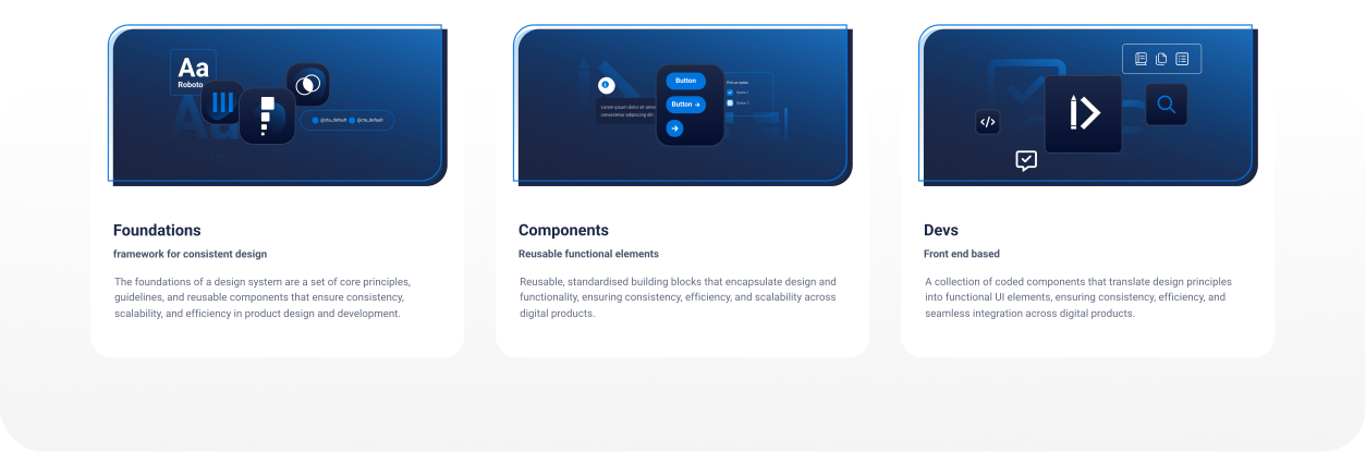
Foundations, components and guidelines
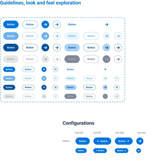
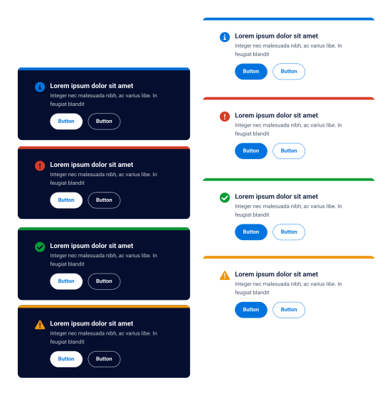
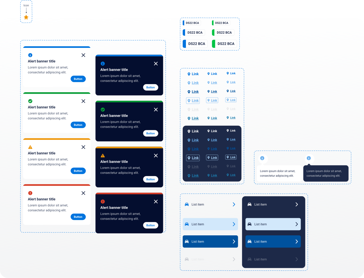
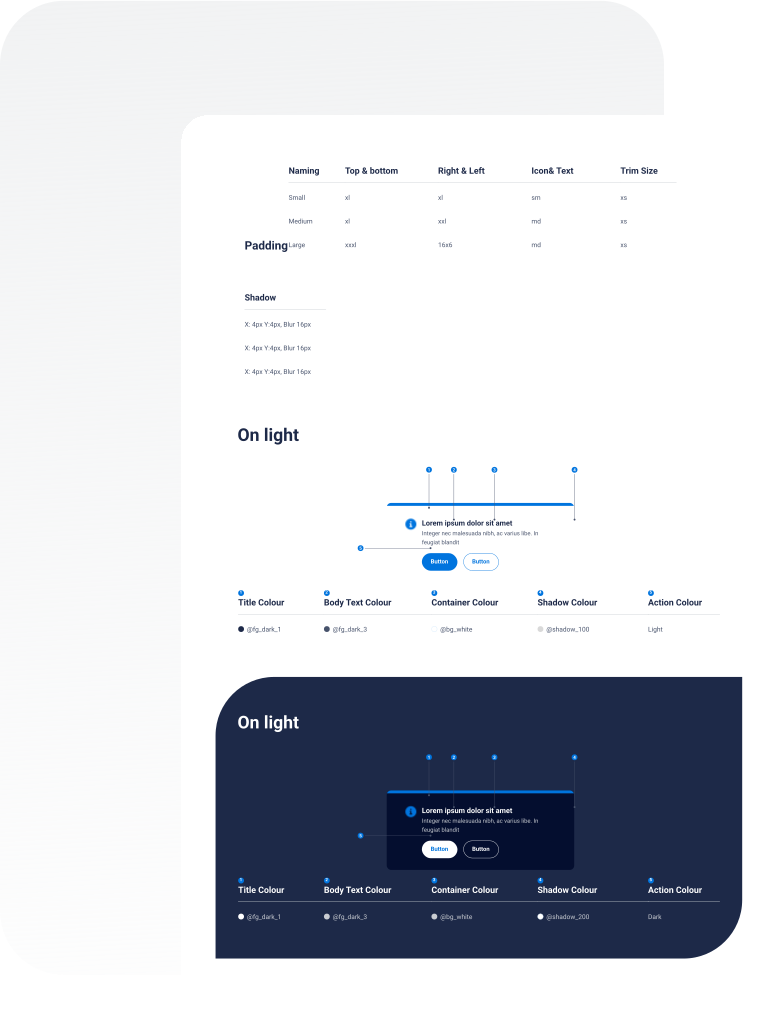
Creating the elements that made the system was essential to give it shape, and to integrate the main values and goals of the brand. Starting with Foundations (including tokens) and followed by the Components Library all supported by through Guidelines.
Ready to use
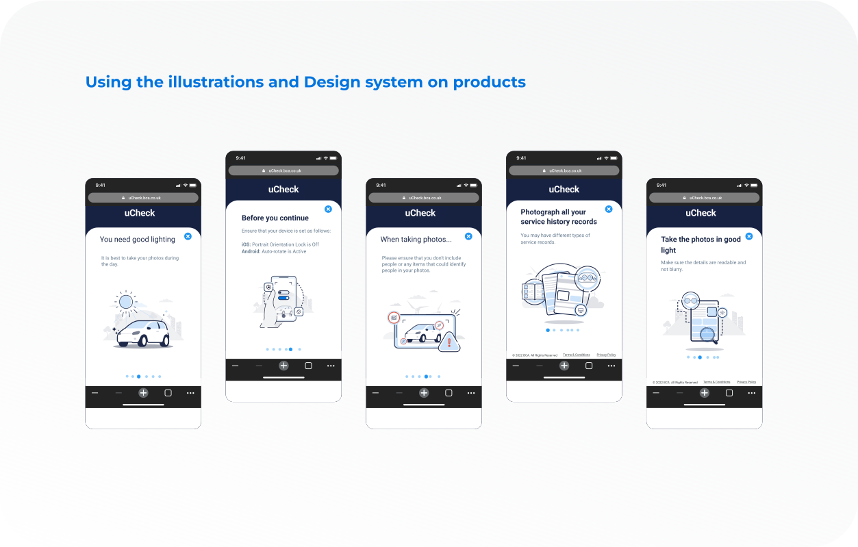
As BCA’s kept growing the need to be able to quickly reshape, adapt and launch new products become a priority. That’s why our design system was specially focus on how to make de system as easy as possible and ready to use and implement its foundations, components, and patterns.
/My role
A brief overview of the project, its goals, and the problem it aims
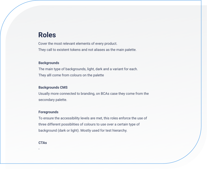
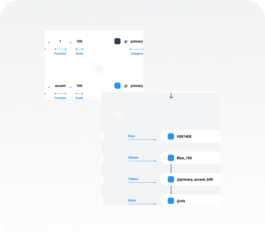
As a way to align the system with its main goals it was essential to create a Tokens systems from the beginning. This way we ensure it was easy to adopt by other brands and allowed future scalability and adaptation to future requirements (such as accessibility updates) making it easy and fast to keep up to date for our customers.
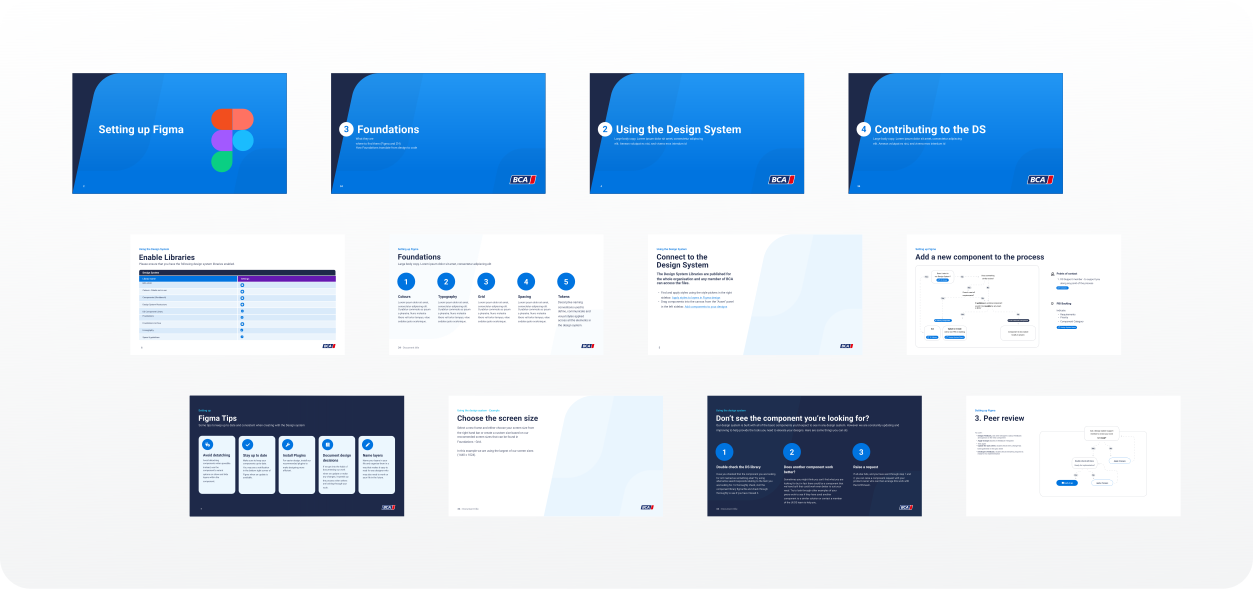
Launch, promote and educate
Starting guide, training sessions, support calls..Identify users (DesignersDevelopersOther companies and departments)
Foundations
/The system in action
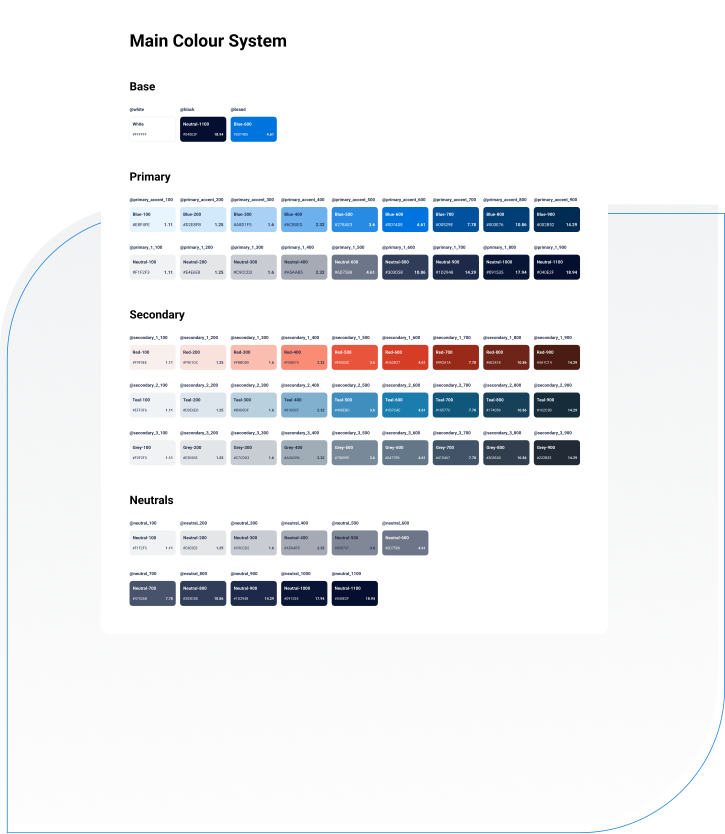
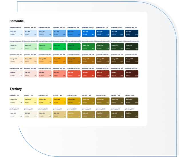
Colour: more than just a palette
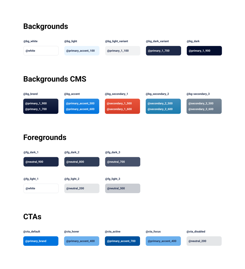
With multiple brands to support, we needed a colour system that was both flexible and precise. Using predetermined contrast ratios, we defined a scalable palette that maintained accessibility and consistency across devices.
Typography with purpose
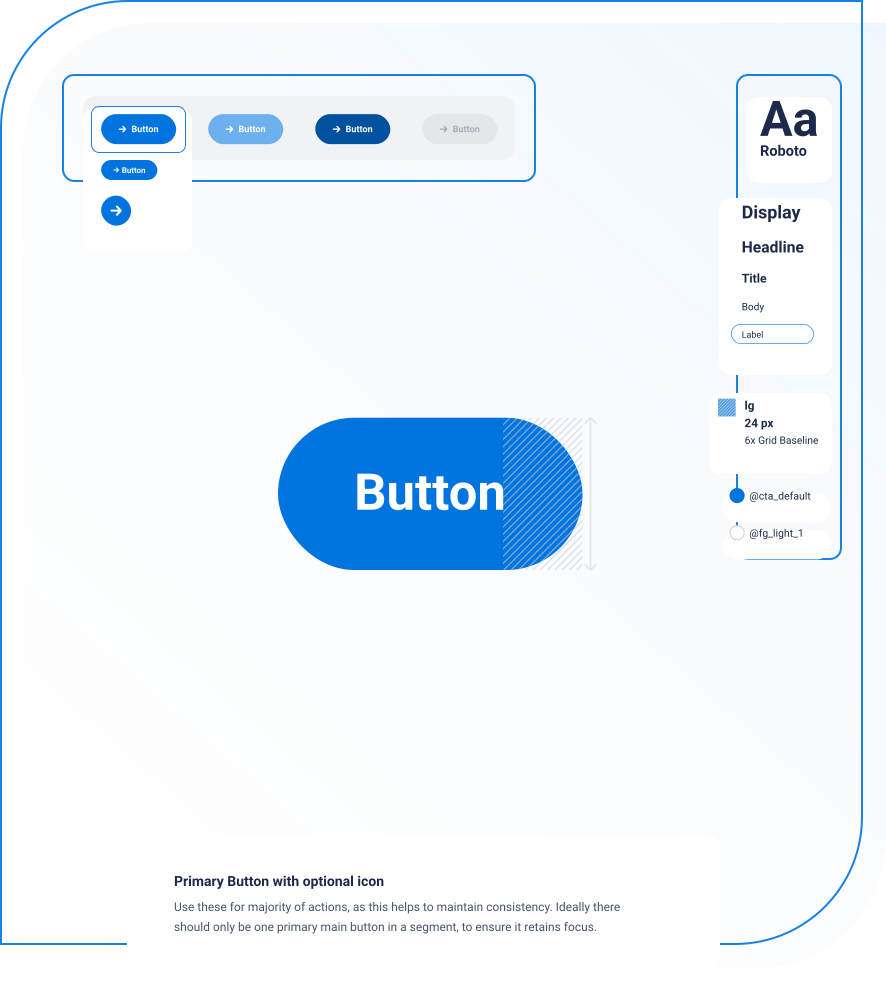
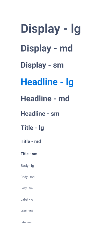
Type choices weren’t just about aesthetics—they were about function. The typography system ensured legibility across screen sizes, with roles like Display, Headline, Body, and Label, each fine-tuned for clarity and usability.
Spacing, grids & layout
A structured spacing and grid system brought clarity to layouts. Built on a 4pt and 8pt grid, it ensured that components aligned logically and predictably, making interfaces feel polished and intentional.
Components
Guidelines
/My take
Crafting a design system from scratch taught me that true cohesion goes beyond aesthetics—it’s about system thinking, adaptability, and structured collaboration. Some decisions feel fundamental at the time, but nothing is set in stone. Evolving, iterating, and embracing change is key. Building a system that balances structure with flexibility is both a technical challenge and a creative one—but when it works, it empowers teams to design with confidence and build at scale.