Grid - Design systems
Foundations
Text here
/Colour Space
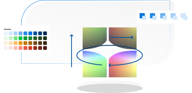
The perception of colour is just as important. Due to the number of existing devices, we had to pay close attention when picking the most optimal colour space.
/Ratios predefined
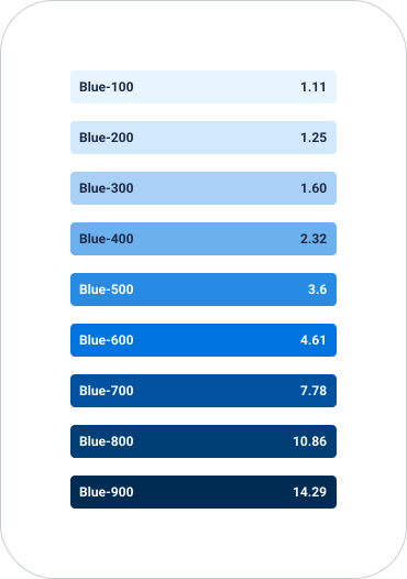
To create consistency and cover every possible need, we have created an extended palette by defining nine different shades, for each colour, through predetermined ratios.
Distributed Ratios
If you go through colour from light to dark in equal steps, the human eye won’t be able to perceive that difference as equivalent (Weber Fechner law). And although it affects every hue, it affects it differently. Because of this, ratios are distributed attending to light. That way, the distance between one step and the other varies to create a perceivable difference between them.
/Creating a colour palette
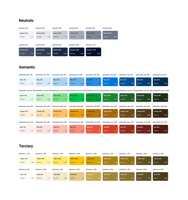
To create consistency and cover every possible need, we have created an extended palette by defining nine different shades, for each colour, through predetermined ratios.
Neutrals
Neutrals represent the greyscale palette, also understood as a lack of hue (the diagonal line on the HSL cylinder). The BCA Neutrals’ palette aims to maintain the brand personality by adding a slight tone of dark blue to it.
Hues
Every hue contains nine shades, situated at a predefined position on the ratio scale, which allows us to align light expectations for every colour.
Yellow & Gold
The ratio steps are adjusted to visually align this hue with the rest of the palette hues.
/Creating a colour system
Main Palette
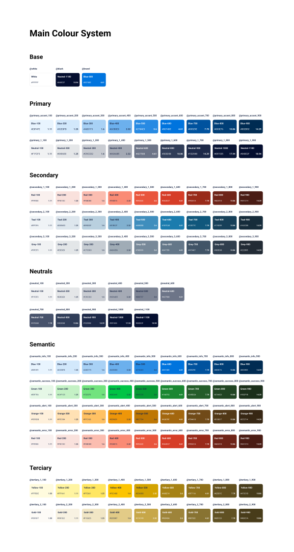
Structured thinkning on the nature of the colour and its meaning inside the brand.
Roles
Attend to the specific functionality and its interaction with the different components.
/Naming Conventions
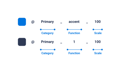
Descriptive names
To create an intuitive language for both designers and developers
Categorisation
Among the names, to create hierarchy when designing
Neutrals
To be able to standirise and adapt other brands to our system
/Keys, aliases & tokens
The common issue around naming conventions is that every brand has its own, when theming and fitting it in our systems it is likely to find disparities. To align that disparities while reusing the system is important to map and understand the different layers of the convention and its implementation.
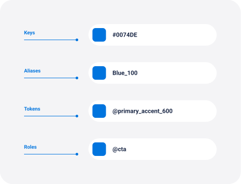
Keys
The hex value of the colour, it is inherited to the colour itself what pinpoints a specific hue and not other.
Aliases
Second layer of naming, is how we call the different hex values as an easier way to communicate them. Every brand has their own aliases for the different hex values.
Tokens
It is the final allocation of the palette into the system. Following the predefined structure of naming, applied on the different components attending to their function or structure.
Roles
Point out to a very specific use as it can be a colour background or a cta. Unlike the tokens, they call to already existent tokens in the system (rather than the aliases).
/Roles
Cover the most relevant elements of every product. They call to existent tokens and not aliases as the main palette.
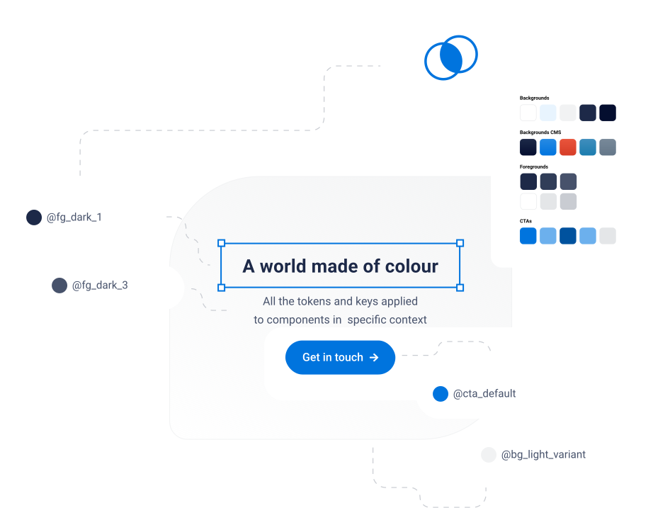
Backgrounds
The main type of backgrounds, light, dark and a variant for each. They alll come from colours on the palette.
Backgrounds CMS
Usually more connected to branding, on BCAs case they come from the secondary palette.
Foregrounds
to ensure the accessibility levels are met, this roles enforce the use of three different possiblities of colours to use over a certain type of background (dark or light). Mostly used for test hierarchy.
Call to actions
Accent colours used for the different types of ctas, they come from the main palette and are used to create a clear hierarchy between them.