Typography
Foundations
Text here
/Principles
Functional
The typography system attends to the role and function of text making its application intuitive.
Responsive
Taking into account different screen sizes and how to keep readability consistent across all of them.
Flexible
Giving space to designers to create different combinations by using roles and sizes.
/Typography structure
Defining type set as the group of type styles organised through categories:
Roles
Have been set to cover the different functionalities for typography on page
Sizes
Each role has three sizes to cover the requirements of that role and give flexibility enough across interfaces, while keeping hierarchy
/Typography roles
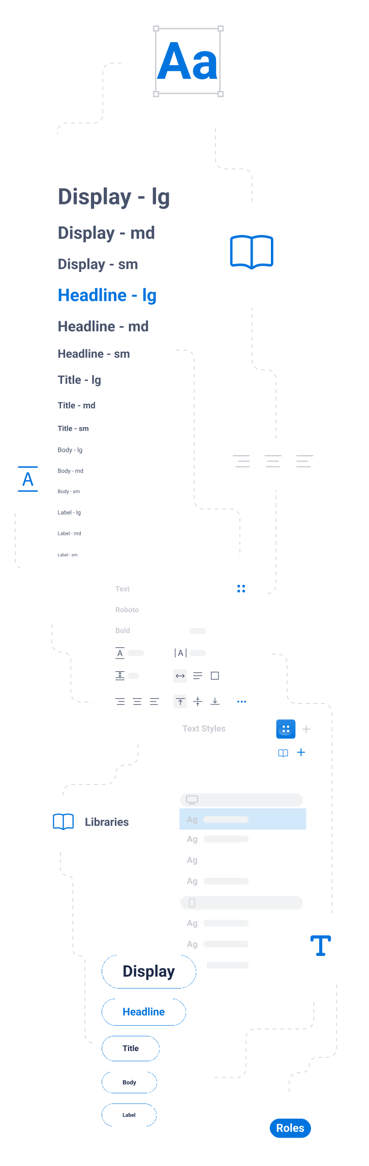
Display
Usually reserved for marketing slogans, data display, or main titles with low SEO relevance. Display styles are best suited for large screens and are almost uniquely used on its bold weight and on a short sentence format.
Headline
They sit at the top of the type hierarchy and are used to emphasize specific text. Commonly used as the main header of a page or area, presented in their bold style. Headlines are essential for laying out pages and establishing a clear visual hierarchy.
Title
This role is reserved for medium-emphasis text that is relatively short. Titles can be used to divide secondary passages of text or secondary regions of content. It's important to keep in mind that titles should be interpreted as short descriptions in code, appearing at the top of a browser window and in SERPs (Search Engine Results Pages). Titles play an important role in SEO, as their purpose is to make people click on them and visit your website, with an average number of characters of 60-70.
Body
The 'Body Role' is designed for longer passages of text, such as paragraphs or informational components. Its heightline is optimized for readability, making it ideal for content-heavy sections of your app. It's typically used for displaying information and conveying large blocks of text to users.
/Breakpoints
Typography has to be responsive, therefore from a design point of view it is important to take into account the breakpoint you will be working in. It’s broken down into three breakpoints: Mobile Tablet Desktop
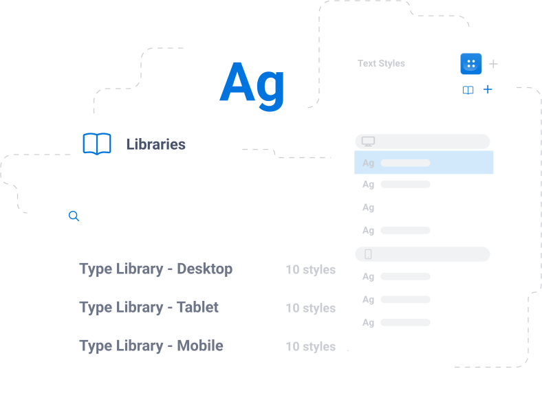
Mobile (xs, sm)
Scale factor (ratio): 1.125

Tablet (md, lg)
Scale factor (ratio): 1.200

Desktop (xl, xxl)
Scale factor (ratio): 1.250

/Calculate the scales
To calculate a range of proportional type scales, the following values are needed:
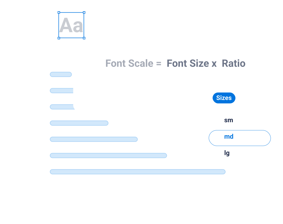
Base font unit
In our system, we have taken 16px as a base unit.
Ratio
It will act as the constant proportion used to calculate the different scales.
How to calculate the scale
Multiply the Font size per the ratio consecutively to get sizes over the base font, or divide to obtain the scales under the base font. Round up to the closest size that fits into our 4pt baseline grid.
/Calculate height line
Height line is defined as the 'vertical space between 2 lines within a paragraph', or the space around a text. It improves readability while supporting the accessibility guidelines. It also aligns the text and makes it fit perfectly into the grid. To calculate the line spacing we need to take into account three different factors:
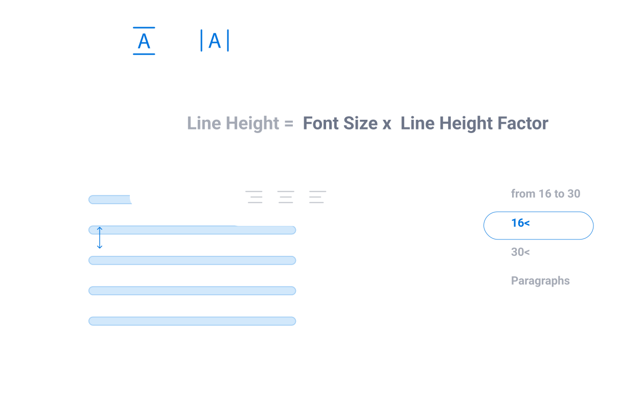
Line height factors
It always relates to the font size to create a proportional space around it. The recommendation is from 140% to 180%. The best way to think about it is that the line height is 1.4 times the font size or 1.8 times the font size.
4pt Baseline grid
Always keeping in mind our 4pt baseline grid, it will need to round up the values to the closest fit in the grid.
Font size
Every font size has its line spacing.
/Adjusting the heightline
Line height factors are not applied equally to every typography scale. They vary and adapt to improve the readability of the different texts.
Standard sizes (from 16px to 30px)
Usually follows a 1.4 factor.
Font sizes under 16px
Small scales of type usually require more space around them. To differ between lines while keeping them connected. A 1.7 factor has been applied to this size.
Font sizes over 30
As the size of the type starts to increase, the space around them needs to be adjusted. For sizes over 30 the advice is to reduce this space; so the text between the lines still feels connected. In this case, a 1.2 factor has been applied which seems optimal for those scales.
Paragraphs (body)
Body sizes could follow the standard, but knowing in advance they will be supporting heavy-loaded information paragraphs, adding an extra point facilitates its readability. Therefore, paragraphs have been set to a 1.5 factor.
/Typography in use
Hierarchy
In design hierarchy, font weight and size must be respected. Headers should have higher contrast and weight than body text.
Responsive
Respect color to create hierarchy: We have established three levels of contrast for each of the light or dark backgrounds. The higher the level of hierarchy, the greater the contrast should be for the text.
Paragraphs
It is advisable to limit the number of characters up to 80. Further than that it usually becomes more difficult in terms of readability.