Grid - Design systems

Foundations

The grid is essential when composing a design and fundamental when locating and positioning any component added to the layout. It also allows to keep a consistent and predictable structure in the content.

/Principles
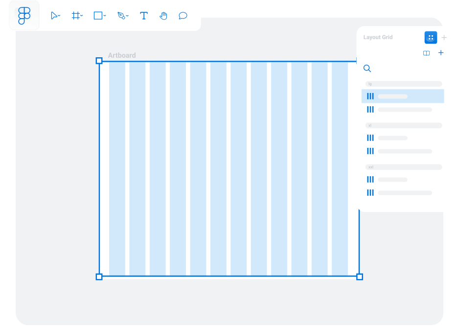
Grid in use illustration

Predictable and logical

Grids can help us to create visual rhythm as well as covering user expectations on where to find information and how it will be structured.

Structure

The location and structure of the individual groups should be aligned and make sense as a part of the whole of the layout composition.

Consistency

Arrange the content into repetitive or coherent groups that became recognisable for the user. Speeding and facilitating navigation across products and layout variations.

/Breakpoints

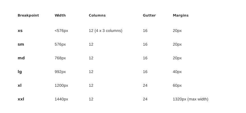
A responsive grid is essential to adjust the columns, margins and gutters across the different devices. Our design system contains a set of 6 breakpoints to cover a wide variety of screen sizes. These keep the jump between widths as smooth and proportionate as possible, keeping a consistent look and feel through all of them.

Breakpoints Table illustration

/Horizontal structure

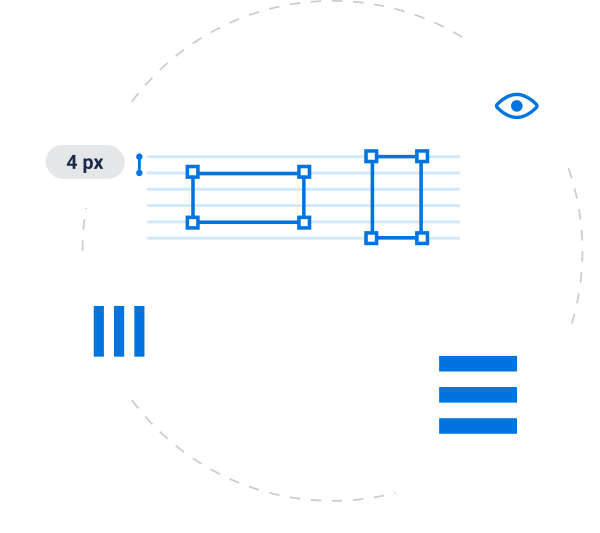
4pt, Baseline grid

Since the majority of the screen sizes are divisible by 4 it made sense to adapt the system to have designs that fit optimally to the highest number of screens. It also offers granularity enough to be flexible when spacing, especially at small scales.

8pt Baseline Grid

It is crucial to understand that, even though the 4pt grid offers granularity, on high scales, the 8pt grid can become quite handy as it gives a larger view of the spacing. Because of this, and it is still proportional to the 4 pt baseline, Therefore, depending on the design we are working on, it may be advisable to use the 8pt grid.

Grid horizontal structure illustration

/Vertical structure

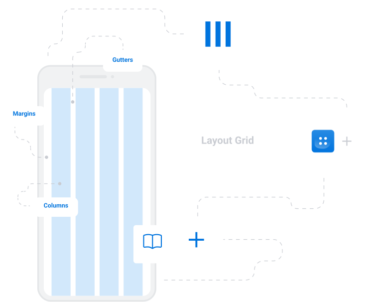
Columns

Horizontal division of the content areas. The number of columns can vary depending on the screen size.

Gutters

Located between the columns. Its function is to separate content. They are a variable value depending on the screen width.

Margins

It is the space between the screen edges and the content. Also a variable value depending on the screen width.

Grid vertical structure illustration

/Locate elements on the grid

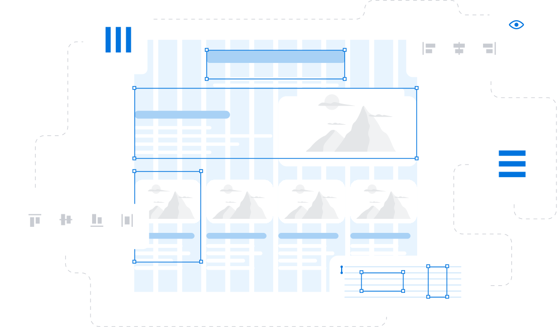
Consider a consistent use of spacing between elements to create a predictable structure for a balanced composition.

Align similar components to create rhythm in the layout.

Fit elements within columns, avoid placing them in gutters to maintain scannability and clarity.

Keep in mind the number of columns when adjusting the layout for different devices to maintain the balance.

Grid Location illustration